GPay Redesign- More accessible, clean, and inclusive
Rethinking GPay: Story of Accessibility and Inclusion
A UX case Study- Written, Designed and Structured by Harshini Saravanan

Note: I tried writing this case study in the framework of StoryBrand suggested by Donald Miller in his book "Building a Story-Brand" to make it more readable and scannable to the audience
The Story Begins
The Hero’s Journey: Users Adapting to Friction
Our heroes—everyday users of digital transactions—embraced online payments as a much-needed relief from the hassle of cash transactions. Whether splitting a bill, paying at a store, or sending money to a friend, Google Pay (GPay) became a go-to option for its speed and convenience. However, beneath the ease of digital transactions lay hidden frustrations. Users struggled with navigation, accessibility, and efficiency, but since online payments were still better than handling cash, these issues were often ignored. Over time, the difficulty became normalized, leading to neglected pain points in a system designed to simplify payments.

Problems
Overloaded & Unintuitive Interface

-
The home screen is cluttered with too many options, making it overwhelming for first-time users.
-
The "People & Businesses" section takes up prime screen space but has low engagement.
-
Key actions like "Scan QR" are placed in less intuitive areas.
Accessibility Issues

-
Small, hard-to-tap buttons lead to frequent accidental clicks.
-
Checking UPI ID and bank balance requires multiple steps instead of quick access.
-
Important features like "Split Bill" and "Request Money" are buried under menus, making them less accessible.
Poor Visual Hierarchy

-
Icons and text labels are unclear, causing confusion for new users.
-
No customization options to rearrange frequently used features.
-
Primary touchpoints (like direct transactions) lack emphasis, while less-used features occupy more space.
Introducing the Guide and the Plan
As a UX designer—and a visually impaired GPay user myself—I noticed the app’s accessibility issues firsthand. Initially, I conducted secondary research on accessibility standards and best practices. However, while recruiting participants for usability studies, I discovered that even people without visual impairments struggled with the same design issues. The only reason they ignored these frustrations was that GPay still felt more convenient than traditional cash transactions.


Simplify the home screen with a clearer visual hierarchy.

Improve button sizes and navigation.

Make critical functions like "Scan QR," "Request Money," and "Bank Balance" easier to find.
Now, UPI Transaction is Truly Effortless
With the redesigned experience, our heroes finally enjoy smooth and frustration-free transactions. Their most-used features are now at their fingertips, accidental taps are minimized, and essential information like bank balance and UPI ID is instantly accessible. As a result, users no longer feel lost in a cluttered interface but instead experience a seamless and efficient payment journey.
The Map of the Plan
Empathise

Conducted secondary research on accessibility and primary research through user interviews.
Define

Identified key pain points by analysing participant feedback.
Ideate

Brainstormed solutions to declutter the interface, improve accessibility, and enhance feature discoverability.
Prototype

Created wireframes and high-fidelity UI mockups to visualize improvements.
Test

Conducted usability tests to refine the solution based on real user interactions.
Why GPay?
Among the many UPI apps available, GPay remains the most widely used and trusted payment platform.
A 2023 report shows that GPay holds over 30% of the total UPI market share in India, making it an ideal candidate for usability improvements that impact millions of users daily.
Attention Towards Our Heroes

"I keep accidentally tapping the wrong button because everything is too small."
"I always have to explain to my parents how to use GPay. The options are too cluttered, and they feel lost every time they open the app."
"I don’t use half the options on the home screen, but I still have to scroll past them to find what I need."
"There’s no way to customize the home screen. I want to prioritize the features I use the most."
"Finding my UPI ID is a struggle. I wish it was just available right when I opened the app."
From Listening to Connecting Dots

88%
88% of users found the home screen overwhelming.

65%
65% struggled with small, hard-to-tap buttons.
52%

52% had difficulty locating their UPI ID quickly.
62%

62% preferred a customisable home screen but found no option for it.
Meet our Heroes

Age : 29
City : Mumbai
Profession: Software Engineer
Rahul Sharma
- Quick and hassle-free digital transactions
- Avoid handling physical cash
- Easily track expenses
Goals
- Finds GPay cluttered with too many features
- Accidentally taps wrong buttons due to small touch targets
- Struggles to locate UPI ID and balance quickly
- Feels overwhelmed by hidden or unclear features
Pain Points
“UPI is super convenient, but sometimes I just want to pay quickly without getting lost in a maze of options."
-
Uses multiple payment apps (GPay, PhonePe, Paytm)
-
Prefers fast, intuitive interfaces
-
Security-conscious but values speed over extra steps
Tech Behaviours

Age : 26
City : Bengaluru
Profession: Freelance Consultant
Low Vision User
Manu Kartik
Seamless accessibility in digital payments
Minimised reliance on assistance for transactions
Reliable voice navigation and easy-to-read UI
Goals
Struggles with small fonts and unclear labels
Screen reader support is inconsistent in GPay
Important functions (like "Scan QR") are not easy to locate
Prefers contrast-rich, high-visibility designs
Pain Points
"I wish the app was designed to speak to me as clearly as a human assistant would."
-
Uses accessibility tools like TalkBack & screen magnifiers
Relies heavily on voice search & dictation features
Prefers apps with clear iconography and customisation options
Tech Behaviours
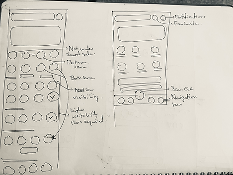
Ideating and Wireframing

Design Evaluations Key

Lack of Clear Visual Hierarchy (Gestalt Principles, Fits's Law)
Problems
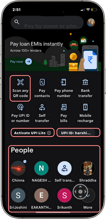
- The most frequent actions (like scanning a QR code and UPI ID) do not appear prominently.
- The "Activate UPI Lite" button gets unnecessary visual weight over more crucial actions.
- The "People" and "Business"section takes up a large portion of the screen, pushing important options down.
Solution
- Size and prominence of the "Scan QR" button is increased.
- Prominent actions are placed appropriate for better visibility and reach.
- "Activate UPI Lite" button is moved to a less intrusive position.

Cognitive Load & Information Overload (Hick's Law)
Problems
- Lack of progressive disclosure—users see everything at once instead of a step-by-step approach.
- Too many similar payment options: "Pay contacts," and "Pay phone number" create unnecessary confusion.
Solution
- Similar payment options like "Pay contacts" and "Pay phone number" are combined into a single option
- Progressive Disclosure Implemented: Only the most frequently used actions are shown upfront and secondary options are moved under expandable menus or tabs to reduce cognitive load.

Cluttered UI (Miller's Law)
Problems
- No clear segmentation of functions, making the screen appear cluttered.
- Repetitive functionalities lead to cognitive fatigue.
Solution
- Visually grouped and segmented functions: Clear section dividers, headings, or cards are used to categorise payment methods, recent transactions, and additional features, reducing clutter.
- Redundant Features are eliminated: Repetitive functionalities are either removed or consolidated (e.g., merging similar payment options) to streamline the interface and minimise cognitive fatigue.

Poost Touch Target Size (Fits's Law)
Problems
- Icons and text elements are small and closely packed, increasing the risk of accidental taps.
Solution
Touch target sizes are increased and sufficient spaces are added between interactive elements to prevent accidental taps and improve accessibility.

Heuristic Evaluation
Problems
Visibility of System Status
Important actions (e.g., Scan) do not stand out, making it difficult for users to recognize primary functions quickly.
Solution
Prioritising key actions using larger buttons, prominent positioning, or colour differentiation to improve discoverability.
Match between System and Real Worls
Overlapping options like “Pay contacts” and “Pay phone number” create confusion due to unclear differentiation.
Merging redundant options into a single action
User Control and Freedom
The "Activate UPI Lite" button is visually dominant, even though it's a secondary feature, distracting users from primary actions.
Reducing its prominence, placing it under settings and focusing on frequently used actions first.
Consistency and Standards
Icons and text elements are small and closely packed, making accidental taps more likely.
Increasing tap target size and sufficient padding
Error Prevention
Users can mistakenly send money to the wrong recipient, and there's no quick way to undo the action once confirmed.
Introducing an "Undo" option available for 30 seconds after the transaction, allowing users to cancel accidental payments before processing.
Recognition rather than Recall
Users have to scan the screen for frequently used actions, leading to cognitive overload. Many users never use certain features like "Self Transfer" or "Bank Transfer," but they remain visible, adding to visual clutter.
Introducing a long-press customisation feature where users can hide unused features. For example, someone with only one linked account doesn’t need Self Transfer, while another user might never use Bank Transfer. They can remove these from the home screen and access them later from settings if needed.
Flexibility and Efficiency of Use
The "People" section takes up too much space, pushing down essential functions.
The "People" section is moved to an independent secondary page under "Recent Transactions."
Aesthetic and Minimalistic Design
No clear hierarchy of elements, leading to visual clutter and reduced scalability.
Prioritised high-frequency actions and de-emphasised less-used features.
Help users recognize, diagnose, and recover from errors
Error messages in GPay are often text-based and lack clear, immediate feedback. Users might not notice failed or pending transactions instantly.
Implementing a clear error handling system: Introduce a 2-second mild vibration for pending transactions and a short continuous 5-vibration pattern for failed transactions. This tactile feedback ensures users recognize transaction status without solely relying on visual alerts.
Help and Documentation
No access to contextual help or tooltips, leaving users unaware of many features and forcing them to deal with a steep learning curve.
Integrating inline tooltips. Users can long-press icons and select "Get help" option to get brief explanations of features. A first-time user guide can also introduce key functionalities when they open the app for the first time.
Let's redesign Together
All these designs are framed together with continuous feedback from our audience. So here, our audience is the main designers.

Notifications on recently received payments, pending payments, and payment requests.
The Star button takes the user to frequently used actions and transactions.
This includes unpaid monthly bills or unpaid payment requests preventing users from forgetting.


The feature grid newly arranged is as per frequency hierarchy. Pay phone number and pay contact are merged. Request money and Split money are introduced in home page for easy access. Bank Transfer is comparatively less used by users than self transfer.

UPI ID being very unnoticed to access made better. People and Business part moved under recent transaction.

Bills & recharges are removed from feature grid as its clearly elaborated below.
Old Screen

Old Screen

Navigation tab bar is introduced. And most primary features are listed here within the reach of thumb.
New Home Page

Old Home Page

New Home Screen

Old Home Screen

New Paid Screen
Old Paid Screen

The amount is given the same weightage of the tick icon.
The undo option appears for 30 seconds to prevent accidental payments.


The undo option appears for 30 seconds to prevent accidental payments.


“Your QR code” is already available as a icon below profile picture. So its removed.
Accessibility settings is introduced to make the app more inclusive
Hide or Show icons is introduced. (to be explained below).
Rewards are moved down

New Profile Screen

Old Profile Screen


Features can be hidden from home screen and can be reaccessed from the profile page

Accessibility Screen
Conclusion
By taking a user-centered approach, we identified key usability issues in GPay that had been previously overlooked. Our redesign aimed to simplify the interface, improve accessibility, and enhance the overall experience. The result? A GPay that truly works for its users—making digital payments seamless and stress-free.
What did I do well?
- User-Centric Approach: Addressed accessibility and usability pain points effectively.
- Prioritisation: Made high-frequency actions (Scan QR) more prominent.
- Customisation: Enabled quick access and long-press actions for better usability.
- Error Prevention: Added undo payment and vibration feedback for failed transactions.
- Decluttering: Reduced cognitive load with a cleaner, more intuitive layout.
- Heuristic-Based Evaluation: Followed UX principles systematically.
What could I improve?
- I could have tested with first time UPI users
- Visual Hierarchy: Improve contrast, animations, and micro-interactions.
- Learnability: Add subtle tooltips or contextual guidance for new users.
- Competitor Benchmarking: Compare with other UPI apps for further improvements.
